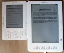
Television adverts for Amazon's Kindle feature catchy pop tunes that stick in your head, coupled with clever visuals that promote the imagination, rather than the actual chunk of plastic.
Now comes the new and improved and lower-priced SuperKindle. Along with a new and remarkably uncreative promotion.
The big improvement, according to Amazon, is the remarkable contrast on the screen that makes it easier to read. You see, with a book, you adjust the contrast by turning on the lamp over your shoulder and shifting either yourself or the lamp to get the best illumination. With a Kindle, there's no shifting that would help the letters stand out better from the screen.
To demonstrate how perfect this new and improved display is, the commercial opens with a very clear image of a book page on the new device. As the camera pans back, we see a lady sitting on a beach, and there's her significant other next to her with his own Kindle.
What's missing?
There's no curling up. There's no book placed on the lap while the reader watches the waves for a minute or two and digests what's just been read. The significant other doesn't have an open book stretched over his face while he takes a brief nap under the summer sun.
Sure the image is one of summer heat, but it's cold. Stiff, inflexible, and uncomfortable would best describe the poses of the Kindle owners in their beach chairs.
Grand that you can download an entire library and store it in a flat little rectangle of plastic. Brilliant that it's been modified to make it easier to read in bright sunlight.
I'll take a book any day. It never needs to be recharged. It won't be damaged if I should drop it in the sand. It's always been readable in bright sunlight.
The new and improved Kindle. Still lacking in the sensory experience of books.

No comments:
Post a Comment